VISIT WEBSITE
Rachael Mae Animation is a website that showcases Rachael’s work and skills as an animator for prospective employers. It enhances Rachael’s
hireability with a clean interface that priorities content. My role was to design the site, perform user testing, and set up the site using WordPress.
Competitive Research
I performed competitive research by looking through the portfolios of other animators. I sought out portfolios of both established professionals and
recent graduates. I did this to gain an understanding of what potential employers may be expecting.
User Personas
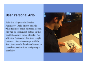
I created two different user personas to let myself better
conceptualize the user and their needs.
Wireframe
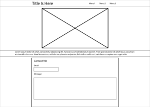
I then made a low fidelity wireframe in Illustrator in
order to think through the website’s content hierarchy.
Prototype
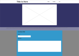
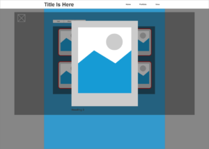
I created an Axure prototype in order to let myself play
with user flow, as well as to demonstrate the user flow to the client.


User Testing
I conducted user testing to watch how someone unfamiliar with the website would navigate it. I asked a mix of artists and non artists to let me watch them navigate the site. Those in my “artist” group were familiar with the idea of an online portfolio, while those in my “non-artist” group were not.


